on nibs, paper, and the pleasures of ink
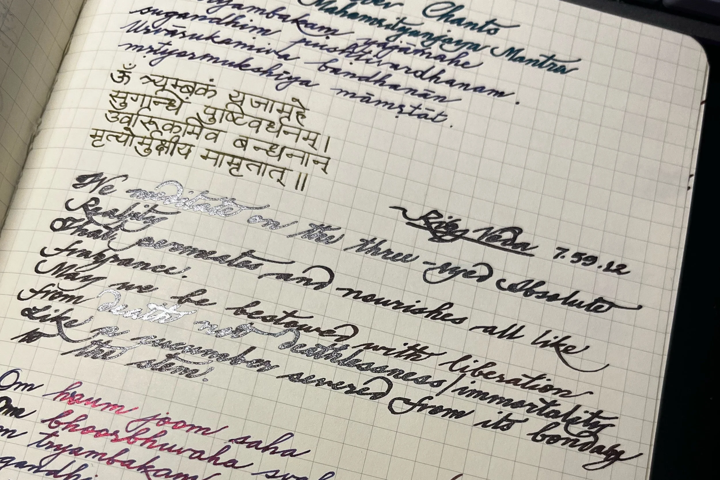
writings from my prayer journal
There is a particular kind of knowledge that accumulates slowly, almost without your noticing. It gathers through the unhurried ritual of sitting with a pen, testing how it moves against different papers, watching how ink dries and pools and shades. Fountain pens have been a daily instrument for me for about a decade now, and what began as an inclination toward a more deliberate mode of writing has become something closer to a quiet obsession with materiality itself: the resistance of a nib, the weight of a notebook, the way a wet ink forces you to slow down and mean what you write.
A friend recently asked me to help her choose her first serious fountain pen and paper, and I found myself writing her what can only be described as an essay. What follows is an expanded version of that, for anyone who is beginning to find their way into this particular world.
On Nibs: Wet and Dry, East and West
The first thing worth understanding is the distinction between wet and dry nibs, which is largely, though not exclusively, a distinction between Eastern and Western pen-making traditions. I say largely because there are exceptions, and because the more time you spend in this world, the more you realise that most of its rules are really just tendencies.
Japanese and Chinese nibs (Sailor being the most significant name here, alongside TWSBI, which is Taiwanese) tend toward precision: a finer, sharper line, and a wetter flow of ink. This is not incidental. East Asian writing traditions were shaped by brush ink calligraphy, where the quality of a stroke, its depth, its pressure, and its deliberate movement were the measure of both craft and character. That inheritance translates into the modern wet nib. It rewards slowness, and shows off ink in a way that a drier nib does not.
I prefer to pair wet nibs with wet inks as they dry more slowly and, in doing so, reveal more of themselves: shading, sheen, the subtle variation of tone across a single letter. J. Herbin's Emerald of Chivor displays a deep and serious teal to emerald green ink with a deep but vivid crimson sheen and gold shimmer. That ink is truly three-dimensional, and I always use an italic nib to truly demonstrate the beauty and abundance of the ink, but I digress. A wet ink forces a kind of intentionality, with your thoughts first, and then with your words on the page. You cannot rush it, and after a while, you stop wanting to.
Western nibs, Lamy (German) being the most familiar, operate quite differently. They are drier, offering more tactile feedback (what writers sometimes call "friction" or "tooth"), faster drying times, and a slightly bolder, more uniform line. I used Lamy exclusively during my years of note-taking in school, and it remains what I recommend for anyone who needs to write quickly and legibly across many pages. It is precise in a different register: practical, durable, and with the Safari line, particularly, something close to a luxury student pen, unpretentious and built to last. I still have mine. It is a Lamy Safari in dark lilac.
The wetness or dryness of a nib is, in the end, a matter of the nib slit's dimensions. That is the whole mystery, distilled.
On Paper: The Three Traditions
Paper matters more than most beginners expect, and I say this as someone who spent an embarrassing amount of time discovering it. A beautiful ink on the wrong paper becomes something else entirely: flatter, faster to dry, less itself. The three papers I return to most often each represent, I think, a distinct philosophy of writing.
Tomoe River (Japanese, 52 gsm) is the paper I have always used for journaling, and the one I am most reluctant to be objective about. It is extraordinarily thin, closer to bible paper than to what most people imagine when they think of a notebook page, and this thinness is precisely what makes it exceptional. The surface has an almost silky quality; the nib skates across it. More importantly, Tomoe River is unparalleled for showing off sheen and shading in fountain pen inks. A wet ink on Tomoe River will reveal colours and properties you may not have known it possessed. The trade-offs are real: slow drying times, some ghosting on the reverse of the page (you can see the writing through to the other side, which some people find distracting), a delicacy that can crinkle if exposed to moisture. The coating on the paper is what allows the ink to sit on the surface without being absorbed by the fibres. But one has to be careful with the natural oils of one's hands, which may damage the paper's quality of holding inks on the surface. I have never found any of this to be much of an impediment. For letter writing, ink testing, and the kind of journaling that wants to be beautiful, nothing comes close.
Clairefontaine Triomphe (French, 90 gsm) is what I would recommend for anyone who wants a luxurious writing experience that is also more forgiving. It has an almost glassy smoothness, not unlike Hahnemühle's photographic papers, and virtually no ghosting or bleed-through. It is the pinnacle of French papermaking, and the Triomphe line has a substantiality to it. It heralds a sense of occasion and makes it ideal for letter writing and calligraphy, but is equally wonderful for daily writing. Drying times are comparable to Tomoe River, which is perhaps its one indulgence. But it is a paper that makes you want to write well, and that counts for something.
Rhodia (French, 80 gsm, and owned by Clairefontaine) is the paper I used throughout my student years, and it remains the one I recommend most readily for those who want quality without the attendant considerations. It dries faster than the other two, shows less sheen and shading (it lacks the special coating of its sibling paper), and has more texture, but this is precisely what makes it practical for daily, high-volume writing. It is widely available, consistent, and honest. For inks that don't need to perform, your plain Diamine, your Rohrer & Klingner, your Noodler's Ink, Rhodia is the right paper and a very good one.
If I had to place them simply: Tomoe River for sheen and shading, Rhodia for daily use and budget, Clairefontaine for the pleasure of occasion.
A Note on Colour
One last thing, for those who find themselves becoming particular about such things, which tends to happen sooner than expected: the colour of paper matters. I prefer Tomoe River cream paper over white for most of my writing. It is a warmer shade, and it brings out certain inks differently. My Diamine Oxblood, my J. Herbin Emerald of Chivor come off as richer and more complex on cream. But Tomoe River's white paper has its own irreplaceability, as my Organic Studios Nitrogen ink, with its deep blue body and purple sheen, is simply more itself on white: the blue reads deeper, and the sheen is more pronounced.
These are small considerations, perhaps. But they are the kind that accumulate, quietly and without fanfare, into a writing practice that feels, over time, entirely one's own. There is a great deal that goes on in the world of paper, nibs, and inks, and I have come to believe that attending to all of it, rather than settling for the nearest available thing, is what makes the difference between writing as a habit and writing as something you actually look forward to.